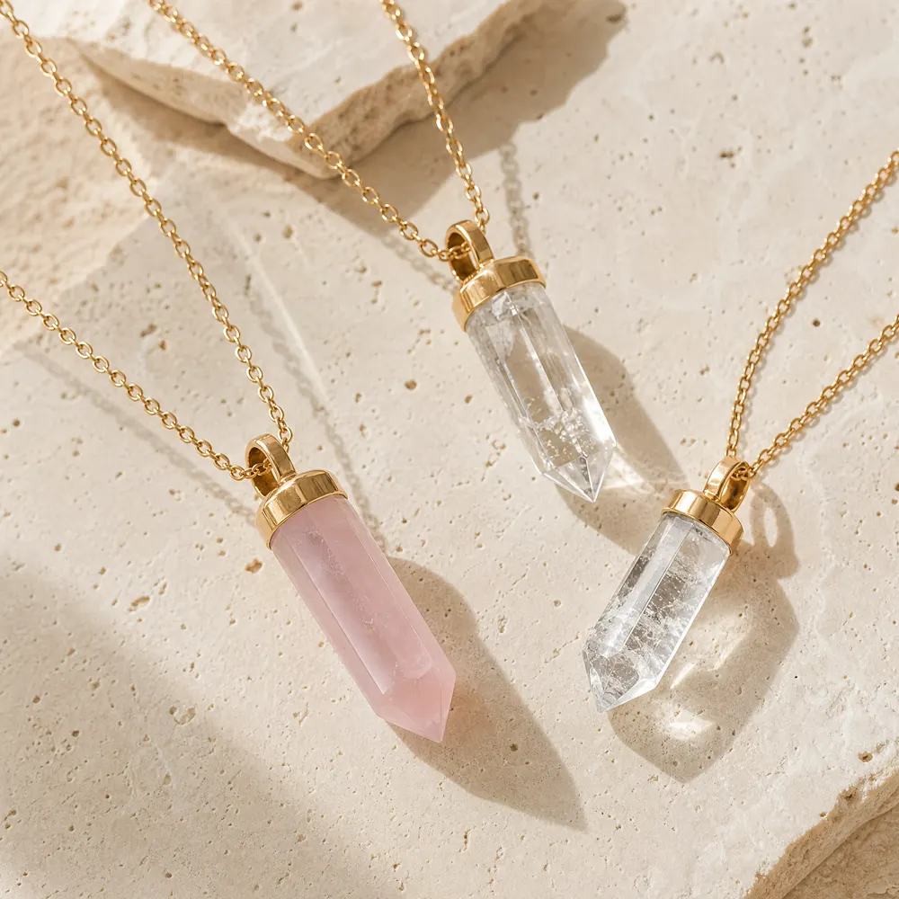
Answer first
Put every decision that changes the finished, sellable colour experience into the brief: the palette’s commercial role, approved hue/tone/saturation ranges, material identity and colour status, metal and finish pairings, SKU-level colour allocation, lighting and sample-review method, substitution limits, and customer-facing colour language. Keep inspiration separate from approval criteria. A swatch alone cannot establish face-up appearance, allowable variation, or the wording needed for listings. Require the final range to be approved against labelled physical samples and recorded in writing before it is treated as the collection standard. [1] [2]
## What must a colour-palette brief decide before any crystal jewelry is sampled?
Start with the job the palette must do in the range. Is it a tightly coordinated launch, a core neutral story with a few colour statements, or a modular assortment that retailers can edit by market? State the number of colour families, the hero and supporting roles, and whether colour must work across necklaces, earrings, bracelets and rings. This prevents an attractive board from becoming unrelated SKUs once metal, scale and stone shapes are applied.
Then turn each colour family into a decision record rather than a poetic name. For coloured gems, hue, tone and saturation are useful building blocks: hue is the colour family, tone is relative lightness or darkness, and saturation is intensity. GIA also notes that face-up colour uniformity matters in evaluation. Use those terms to specify what a buyer needs to see, while recognising that cut, lighting, transparent or opaque material and setting can change the apparent result.
Give each colour a clear status: essential, acceptable alternate, or not approved. That status makes seasonal edits and substitutions manageable. A social image, digital chip or named trend may inspire the direction; it is not evidence that a delivered component will match the intended face-up colour. Do not imply a material, origin, treatment status or optical result that has not been documented and approved.
The buyer’s first question is therefore not ‘Which colours are fashionable?’ It is ‘What must be visually consistent for this range to read as our brand, and what variation can our customer reasonably accept?’ Write the answer at collection level and SKU level, because an accent stone can tolerate a different range of variation from a centrepiece design.
Buyer checklist
- Name the collection objective and customer-facing colour story.
- Set the number of core, supporting and accent colour families.
- Define each family by observable hue, tone and saturation, not only a marketing name.
- Identify which colours are hero, repeatable core or limited accents.
- Record whether consistency is judged face-up, in a matched pair, or across a set.
- Separate inspiration images from signed physical approval references.
- Assign one internal owner for colour decisions and version control.
## How should a buyer translate a mood board into measurable colour direction?
Make the palette a small specification sheet. For each colour, include a plain-language approved appearance, a boundary for lighter, darker, greyer or more vivid variation, and the intended visual role. For example, ‘soft blue-green, light-to-medium tone, muted rather than electric’ is more actionable than ‘coastal aqua’. Add a labelled reference photo only as supporting context, because camera processing and screens vary.
Specify the viewing conditions used for approval. Agree a clean neutral background, the sample orientation, and at least one consistent daylight-equivalent or defined retail-light check. Record whether stones are evaluated individually, as a pair, or set in the finished style. A loose component can look more open and bright than the same component behind a bezel or beside a reflective plated surface; a finished sample resolves that question.
Use a traffic-light approval rule. Green means the piece falls within the signed reference and may be used. Amber means it is a meaningful but potentially acceptable visual difference that needs named buyer approval. Red means the colour breaks the collection story or the SKU matching rule. This is a decision control, not a claim of laboratory colour grading.
Ask for unedited, consistently lit images alongside the physical sample where remote review is necessary, but do not substitute images for the approved sample. The written brief should say which evidence governs if photo and sample appear different. It should also state whether a revised sample resets the reference or is only a comment sample.
| Brief element | Decision to record | Buyer approval question |
|---|---|---|
| Hero colour | Hue family, target tone, saturation ceiling/floor and face-up role | Does it still read as the collection’s signature colour when set? |
| Neutral | Warm/cool direction and allowable shift near metal | Does it support every key silhouette without competing with the hero? |
| Accent | Maximum SKU count and pairing rules | Is the accent intentionally scarce, or has it become a second core colour? |
| Variation boundary | Green/amber/red examples against the approved reference | Who can approve an amber sample, and in what record? |
| Review method | Lighting, background, sample orientation and evidence hierarchy | Can two teams reproduce the same approval decision? |
Buyer checklist
- Provide a plain-language target for every approved colour family.
- Define acceptable lightness, darkness and intensity movement.
- Identify the neutral background and lighting approach for review.
- State whether matching is per component, pair, set or finished SKU.
- Use green/amber/red outcomes and name the person who may accept amber.
- Version-label every reference image, chip and physical sample.
## Which material and colour-status choices must be explicit?
‘Crystal’ can describe different materials in retail language, so the brief must not leave product identity to colour direction alone. List the material description to be used internally and the customer-facing term proposed for each SKU, subject to applicable requirements and supporting documentation. Separate mined gemstones, laboratory-created stones, imitation or simulated materials, glass crystal and coated components rather than relying on a colour name that may suggest something else.
Colour can result from the material itself, a coating, dye, treatment, plating reflection or a combination of these. The approved brief should request relevant colour-status information and any special-care information needed for the intended product description. In the United States, the FTC Jewelry Guides state that treatment disclosure is needed when a gemstone treatment is not permanent, creates special care requirements, or significantly affects value. This guide does not give legal advice; have applicable requirements and product wording reviewed by qualified advisers for each sales market.
For global working language, CIBJO’s Blue Books are voluntary, living standards covering jewellery nomenclature and grading. They are a useful vocabulary reference, not a replacement for market requirements or the buyer’s written specifications. Keep final consumer descriptions aligned with approved documentation.
Avoid wording such as ‘natural-looking’, ‘pure’, ‘healing’ or any unverified permanence statement in a colour brief. It does not improve a palette decision and can create ambiguity. Keep the brief factual: what the component is represented as, what visual colour is approved, what documentation is requested, and which statements remain subject to review.
| Colour-source scenario | What the brief should request | What not to assume |
|---|---|---|
| Colour inherent to the represented material | Approved visual range and supporting material description | That every lot will look identical or that origin is established |
| Coated, dyed or otherwise colour-altered appearance | Description, care and disclosure review inputs where applicable | That the colour is permanent or needs no special-care consideration |
| Laboratory-created, imitation or simulated component | Clear proposed terminology and documentation for review | That a mined-stone name may be used without a qualifying description |
| Metal or plating affects appearance | Finished-sample review beside the selected finish | That loose-stone colour represents the final SKU |
Buyer checklist
- Name the material category separately from the colour family.
- Record the proposed product-description term for each material type.
- Request documentation relevant to colour, treatments or coatings where applicable.
- Flag special-care wording for review when relevant.
- Prohibit unsupported origin, treatment, durability and benefit claims.
- Confirm final sales-copy review against applicable requirements and qualified advice.
## How do metal finish, setting and proportion change the palette decision?
Approve colour with the specified metal colour and finish, not in isolation. Warm yellow or rose-toned settings can shift a pale component’s perceived warmth, while bright white finishes can make the same component appear cooler or sharper. The point is not to prescribe a universal pairing; it is to decide which pairings serve the brand direction and to make them part of the approved combination.
Setting construction and silhouette matter as much as the metal. A closed back, bezel edge, claw spacing, halo, enamel detail and amount of visible material can change how strongly a colour reads. The brief should list the intended setting style and whether colour must remain visible from a normal consumer viewing distance. A pale component that meets a loose-sample reference may disappear once used as a small accent.
Create a matrix for combinations rather than approving every colour with every finish by default. A practical launch might approve the hero blue with a bright white and a yellow finish, reserve a warm neutral for yellow finish, and keep a vivid accent to one silhouette. The matrix gives merchandising a clear rule and stops later line extensions from diluting the visual hierarchy.
For matched jewellery, set a separate rule. Earrings and multi-stone designs need an agreed tolerance for pair-to-pair and within-piece colour difference. Define whether a mixed, ombré or intentionally varied look is designed variation. If it is not deliberate and described, it can look like inconsistent selection rather than a collection choice.
Buyer checklist
- Approve each priority colour with its intended metal colour and finish.
- Record the setting type, backing and component visibility that the sample represents.
- Define pair-matching expectations for earrings and multi-stone pieces.
- Identify combinations that are approved, conditional or excluded.
- Review hero colours at the actual component size and finished scale.
## What should seasonal colour planning control, and what should stay flexible?
A seasonal jewelry color brief should protect the core brand palette while allowing a controlled edit. Begin with carryover colours that must remain visually compatible with existing core pieces. Then define seasonal additions by role: one campaign colour, one supporting shade and, if needed, one limited accent. This makes the collection easier to merchandise across different retail calendars without requiring a full redefinition of the brand’s colour language.
Do not use a trend name as the approval standard. Translate it into an observable direction and decide where it appears: only in small stones, only in plated-metal accents, or across a family of SKUs. Confirm whether the season’s colour must coordinate with photography, apparel, packaging art or store fixtures, but do not assume any packaging or display capability. Those are separate commercial scopes subject to written quotation and approval.
Build flexibility at the level of role, not ambiguity. For example, the brief can permit an accent in several approved green-blue expressions while demanding a consistent light-to-medium tonal range. It can allow an amber review route when a component is visually close but slightly less saturated. It should not leave ‘similar turquoise’ unbounded, because different teams may interpret it differently.
For Europe, North America and the Middle East, use one master approval file with local assortments below it. Record which names are internal working terms and which consumer terms need market review.
Buyer checklist
- Separate carryover, seasonal and limited colour roles.
- Set a maximum SKU count or share for each seasonal accent.
- Define which shapes and sizes may carry the seasonal colour.
- Keep market-specific assortment edits below a single master colour standard.
- Route local product names and claims through applicable review.
## What does a robust colour approval and change-control process look like?
The final approval should identify the finished SKU, component colour family, metal finish, reference-sample identifier, date, approver and decision. Include a short reason when an amber sample is accepted, such as intentional tonal softness for a small accent. This creates a usable trail for design, sourcing, e-commerce and quality review without pretending that all material variation can be eliminated.
Set a change trigger before the range is handed over. A change should be routed for review when the approved material category, colour source, target hue/tone/saturation, metal pairing, setting construction, product wording or reference sample changes. Do not silently treat a new component source or an edited colour treatment as equivalent just because the image appears close. Ask for an updated sample and documentation appropriate to the change.
Use two approval gates: first, approve palette rules on representative finished samples; second, confirm the final SKU reference and description inputs. Keep comments specific. Retain the signed reference until a replacement is formally approved.
Close with an ownership map: brand teams own direction; sourcing coordinates sample evidence; product or compliance reviewers assess wording and requirements; qualified advisers handle legal questions. Commercial details remain separate unless agreed in writing.
| Approval gate | Evidence | Decision output |
|---|---|---|
| Palette gate | Representative finished samples, combination matrix and labelled references | Approved colour families, metal pairings and variation boundaries |
| SKU gate | Final finished sample, proposed description inputs and reference ID | SKU-specific approval, conditional note or resample request |
| Change gate | Description of changed material, colour, construction or wording plus updated sample | Written confirmation that the original approval stands or is replaced |
Buyer checklist
- Give every approved reference a unique identifier and version date.
- Record SKU, colour family, material description, metal and setting together.
- Name approvers and the allowed escalation route for amber decisions.
- Require review for material, treatment, colour, metal, construction or wording changes.
- Keep signed samples and the current digital approval file aligned.
- Separate palette approval from commercial terms and other unagreed scopes.
Frequently asked questions
Is a Pantone-style chip enough for a crystal jewelry colour approval?+
No. It can communicate design intent, but it cannot by itself approve face-up appearance in the actual material, cut, size, setting and metal finish. Use it as a reference alongside a labelled finished sample and written variation boundaries.
How many colours should a private-label crystal jewelry launch contain?+
Choose the number from the collection’s merchandising job, not a fixed formula. A practical brief distinguishes core colours from supporting and accent colours, assigns each a SKU role, and prevents every silhouette from carrying every shade.
How should we handle a sample that is close to the approved shade but not identical?+
Compare it under the agreed review conditions against the signed reference, then classify it green, amber or red. An amber acceptance should be written, tied to the SKU or lot under review, and should not silently change the master standard.
Can the brief call a coloured component a gemstone?+
Only use terminology that accurately reflects the represented material and is supported by documentation and applicable requirements. If the component is laboratory-created, imitation, simulated or otherwise has a qualifying description, have customer-facing wording reviewed before sale.
Conclusion
A strong crystal jewelry colour palette brief converts a visual direction into controlled decisions: observable colour boundaries, material-aware language, approved finished combinations and a documented route for exceptions. Approve the real finished sample, retain a clear reference trail, and review product wording against applicable requirements before the collection is released.
Product category references
Explore relevant GemMira formats.
Next step
Move from general guidance to your specific brief.
For a GemMira wholesale, private-label, or custom inquiry, share the product category, market, material direction, and any available reference images. Commercial terms, final specifications, and sample options are confirmed in a quotation and approved pre-production sample. Email your requirements to info@gemmira.com.
Start an inquiry with this guide →Email info@gemmira.com